⚠ Disclaimer: This project is a fake case study for the purpose of completing my internship task at Skilvul Virtual Internship x Kampus Merdeka.
📌 Problem
Appa has experienced a decrease in revenue since last year and research has found several problems such as users being dissatisfied with the appearance, the platform being complicated to use, very slow loading, and difficulty finding motivation to learn. Therefore, Appa wants to completely overhaul its platform with the goal of becoming user friendly with an attractive appearance and being able to increase motivation to learn when using its platform.
⏳ Design Process

✍ Define
Here, we define some problems that we have found in the form of pain points, which are then narrowed down into a question (How Might We) in order to focus on the desired objectives that we want to achieve.
Pain Points

How Might We
"How to make users comfortable using the app" and "How to make a more attractive appearance"
🧠 Ideate
After questioning the problem in the form of HMW, at this stage we generate some potential solutions that might address the issue, which we then classify using an affinity diagram to facilitate prioritizing solutions based on user value and effort.
Affinity Diagram

Among the many solutions offered, there are priority ideas that can be implemented, including:
Gamification, bringing a game experience into learning is something interesting and enjoyable, so anyone who learns on this platform will not easily feel bored.
Video learning, the most popular alternative to reading.
Exercise, as a reflection after learning to improve and validate learning results.
Learning path, helps users learn according to their interests and structured learning.
Crazy 8's
After that, we created Crazy 8 to give an idea of the appearance of the application to be created.

Userflow
After knowing the outline of the application, we compiled several task flows to determine the user flow based on the expected user experience of this application later.
Login & Registration

Complete Profile

Course Transaction

Course & Quiz

🎨 Prototype
At this stage, we continued the project individually, where I started to create wireframes, style guides, mockups, and interactive prototypes.
Wireframe

Style Guide

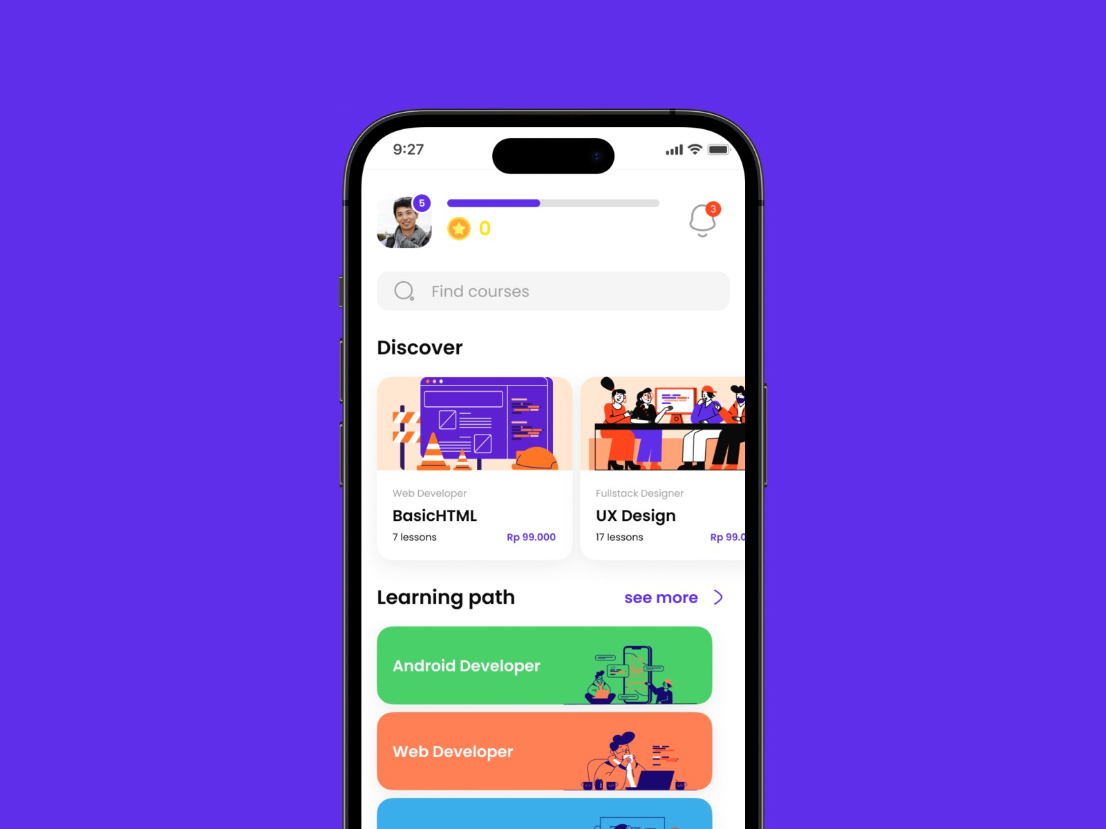
User Interface

Final Prototype
After completing each UI frame, I began creating a prototype that you can try out here.
🤳 Testing
Here is the feedback obtained after testing with users:
There is no show password feature when completing the profile
It is better to remove the lock icon on the material
Less registration through phone number
Add fast payment button less clear/less firm
Differentiating the color of the ongoing course
The font size button on the material is not conveyed and disturbing
🔄 Iteration
After receiving feedback from the user, new insights emerged that provided solutions to the user's problems, thus achieving the user's desired goals. Here are the results of the mockup design before and after improvements:
Adding an alternative registration using a phone number but still using the same input field.

Changing the class sign for those that have not yet been purchased, which previously had a lock icon to faded text.

Adding a show password feature to help users ensure that the entered password is what they intended.

Making the "Add payment method" button more firm to reassure users that the button can be pressed.

Marking completed course material to help users track their learning progress.

Removing the font size button that is deemed disturbing and of lower priority.

✌ Conclusion
After defining the problem and ideating possible solutions, the features I was able to offer were gamification, video learning, practice, and learning paths. Testing results showed that the app is easy to use and the information provided is easily understandable. This case study is far from perfect, but I hope it can help me and my friends in the future. Thank you😊